Keeping Australian manufacturing strong. The Volgren rebrand
The brief for this project was to help keep the 500+ employees of Australia’s largest remaining vehicle manufacturer from become more victims of the flagging Australian manufacturing Industry. To do this we were asked to update the brand into the 21st century, whilst still maintaining some of it’s brand heritage and introducing the new parent company Marcopolo. The new visual identity for Volgren also had to compete with the high level of polish shown by some of it’s international competitors.
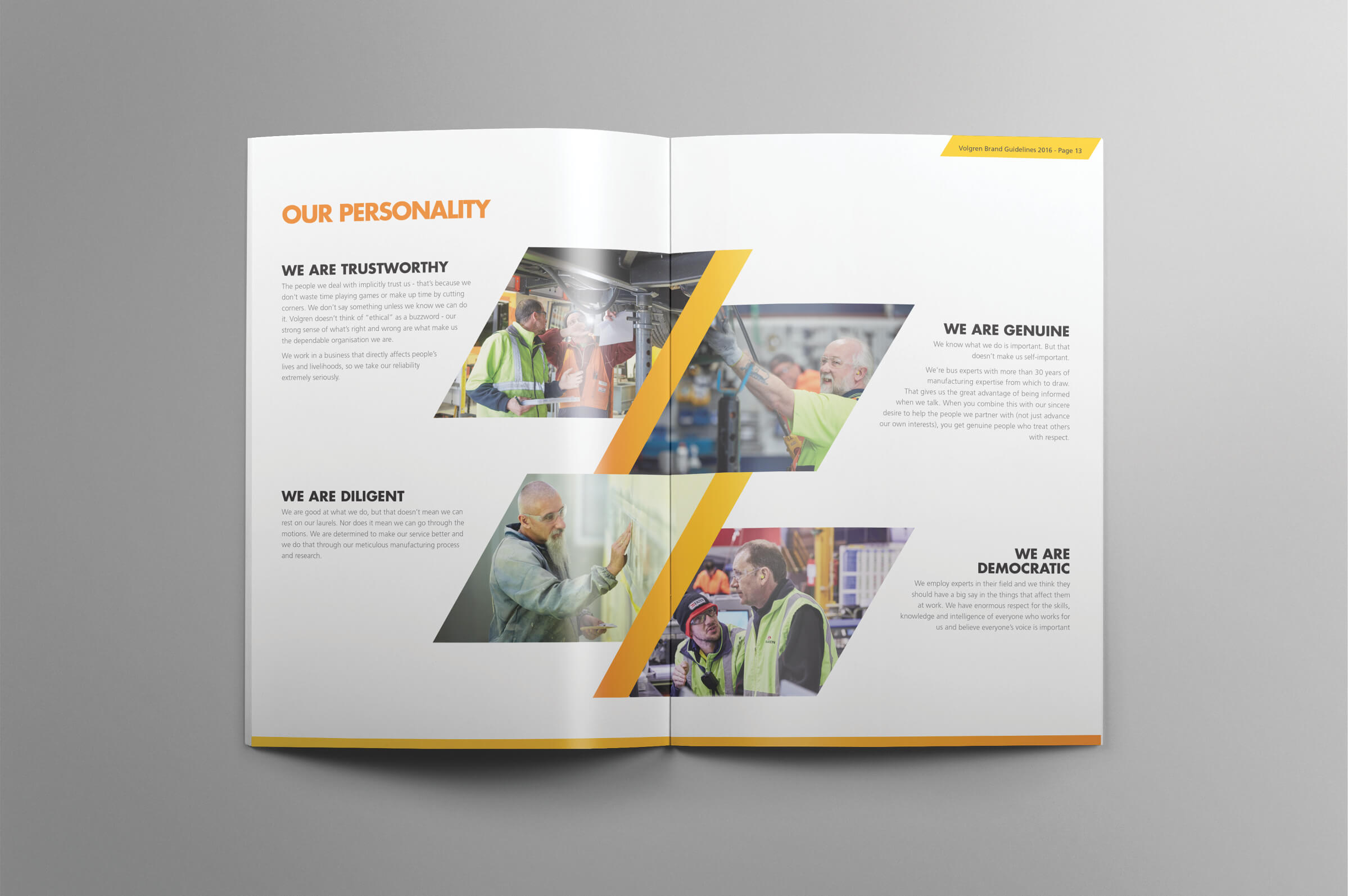
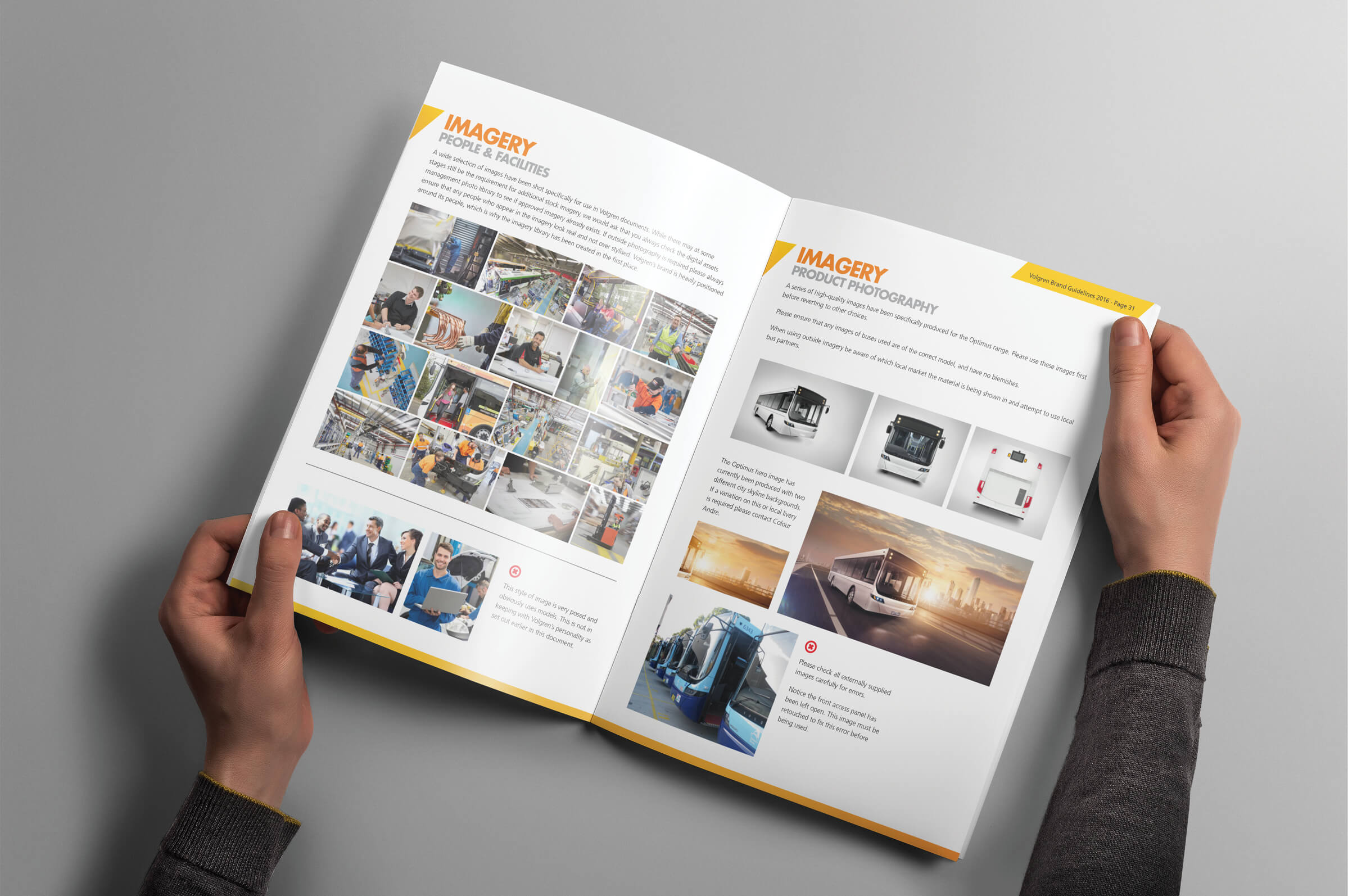
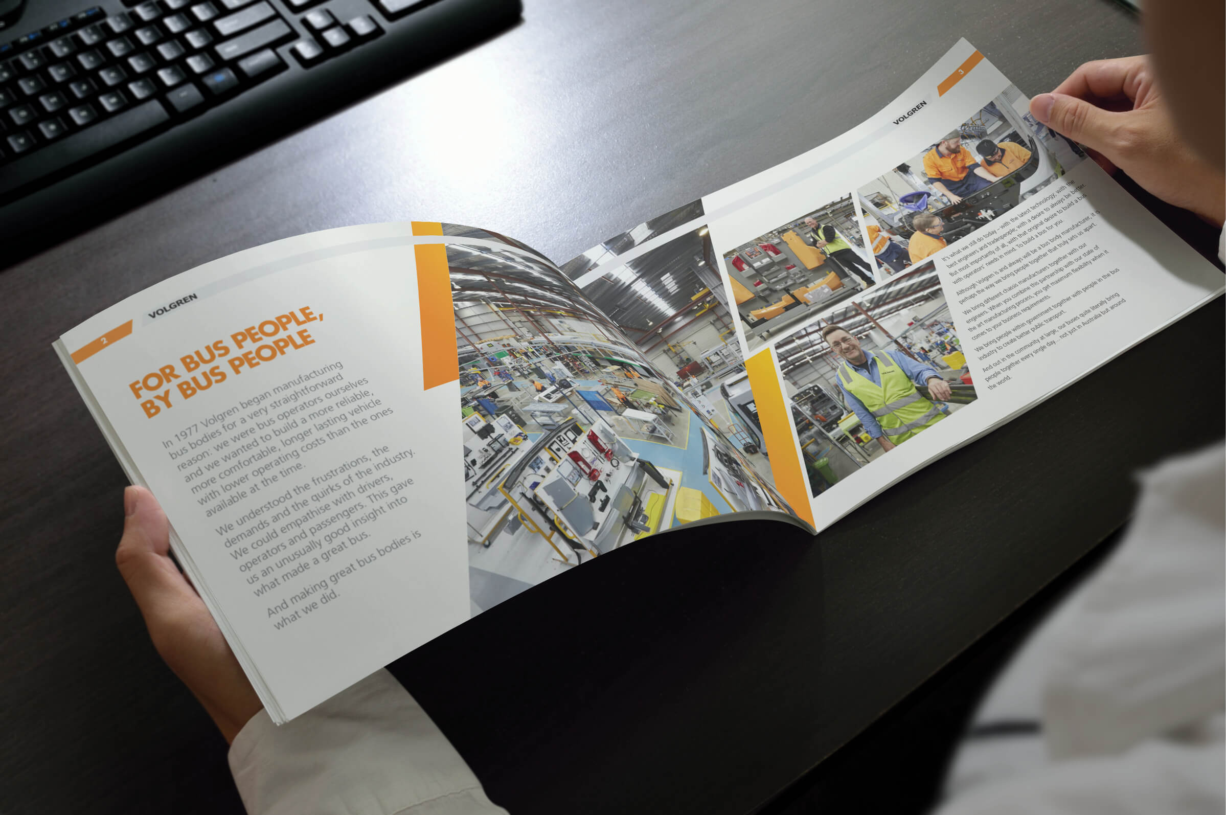
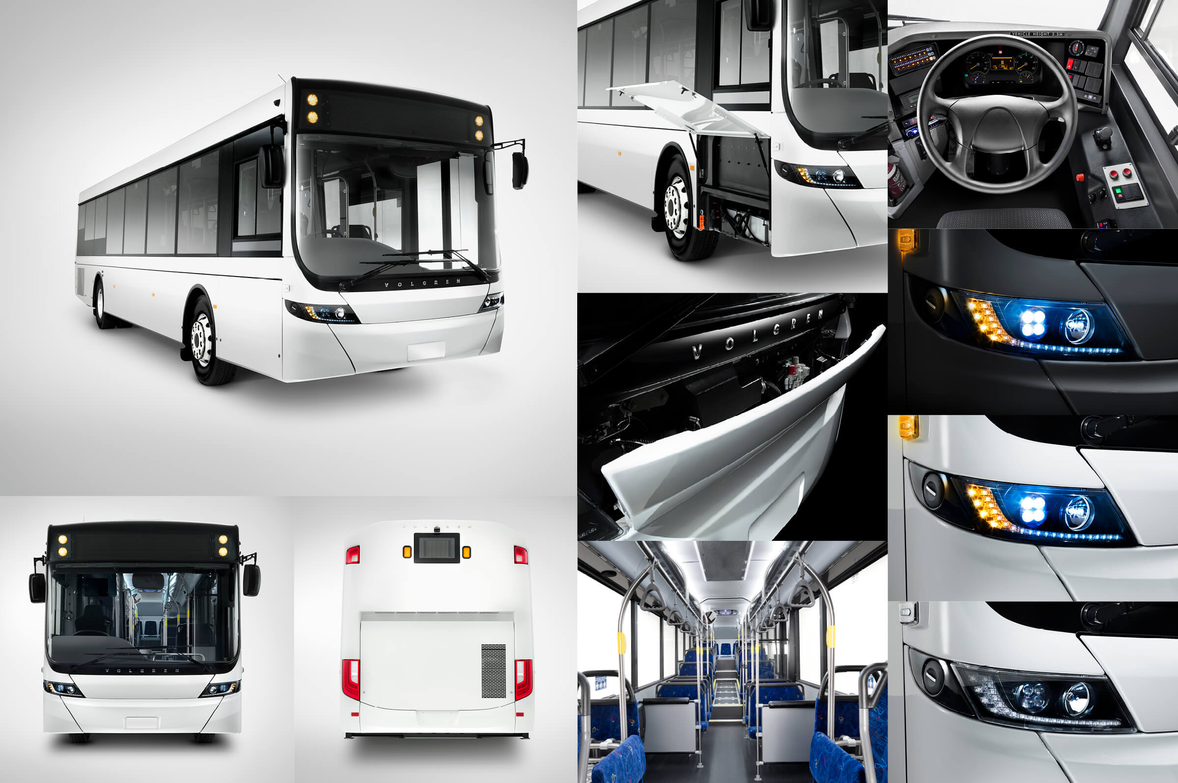
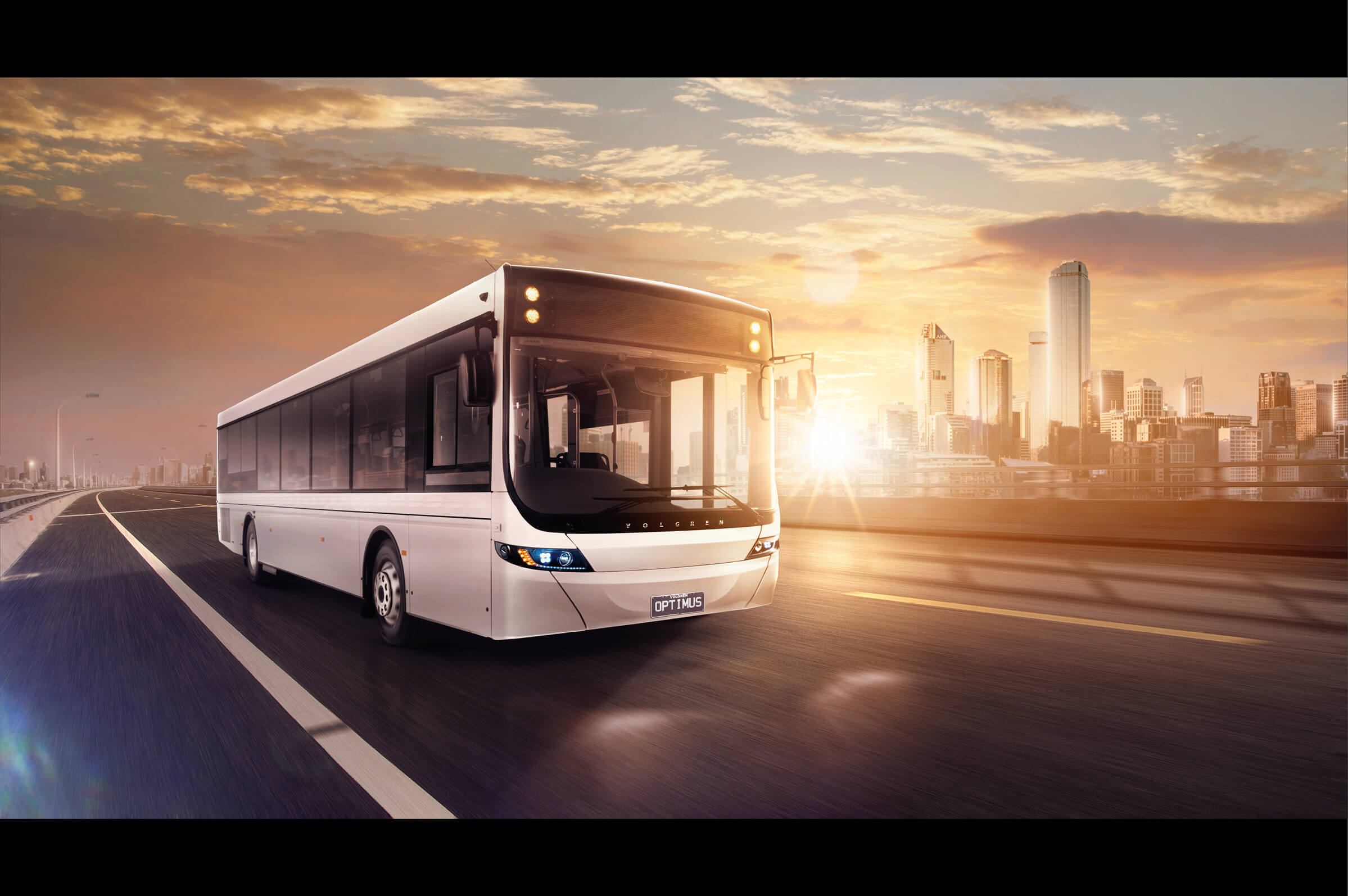
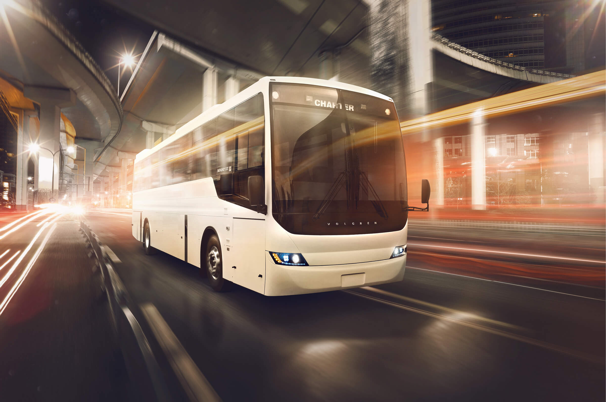
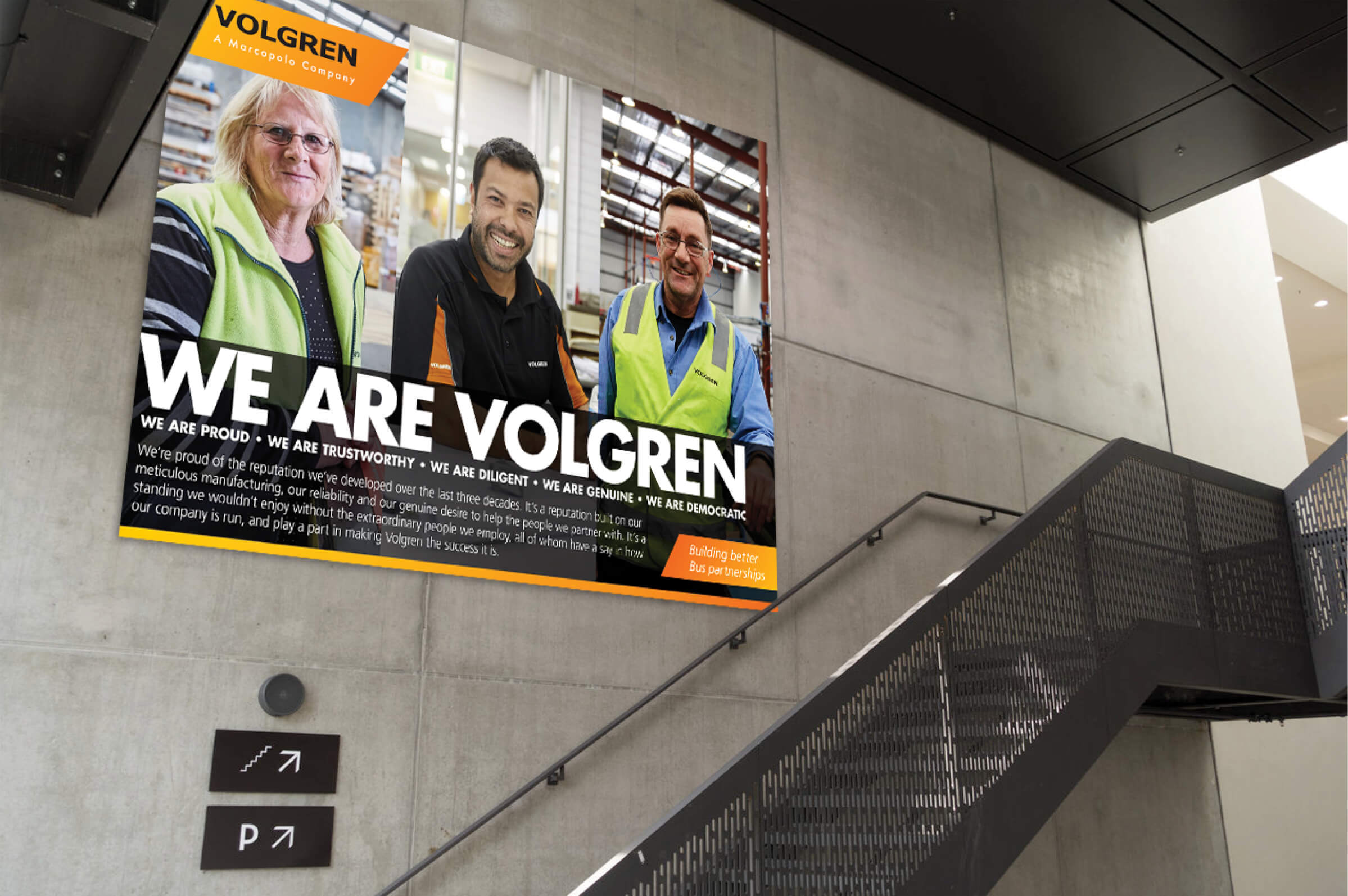
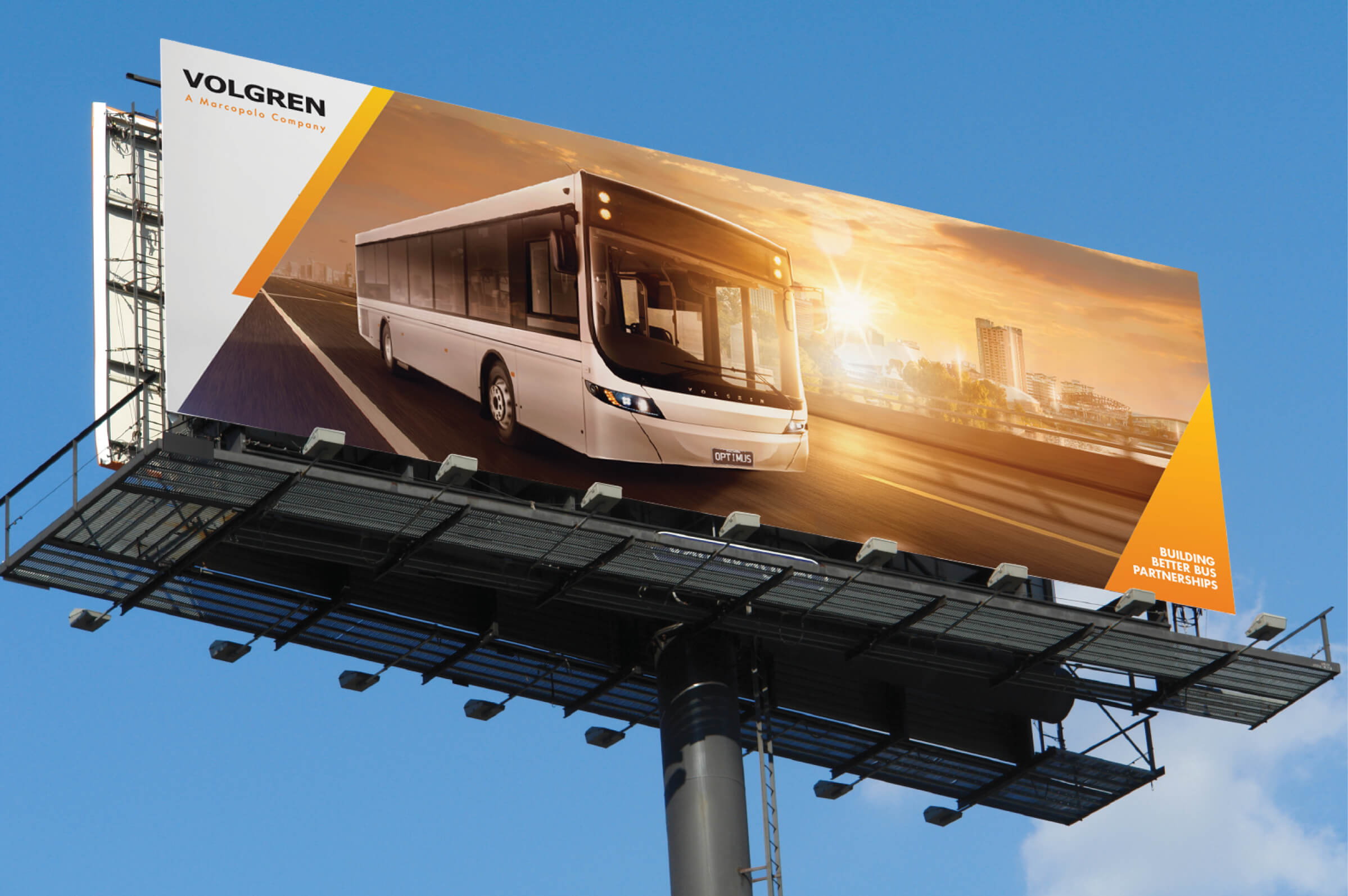
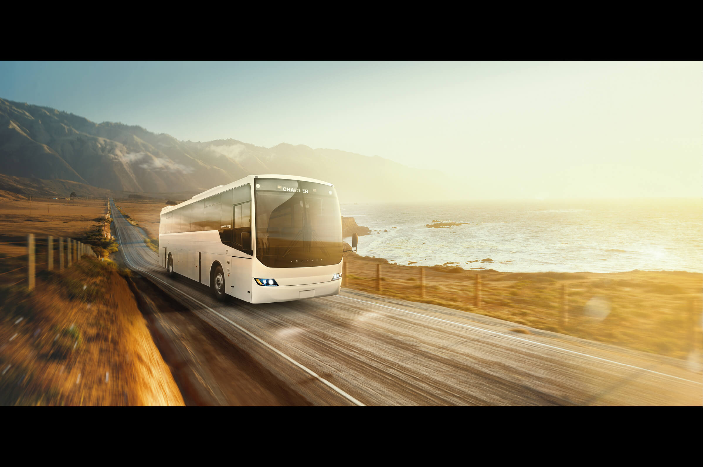
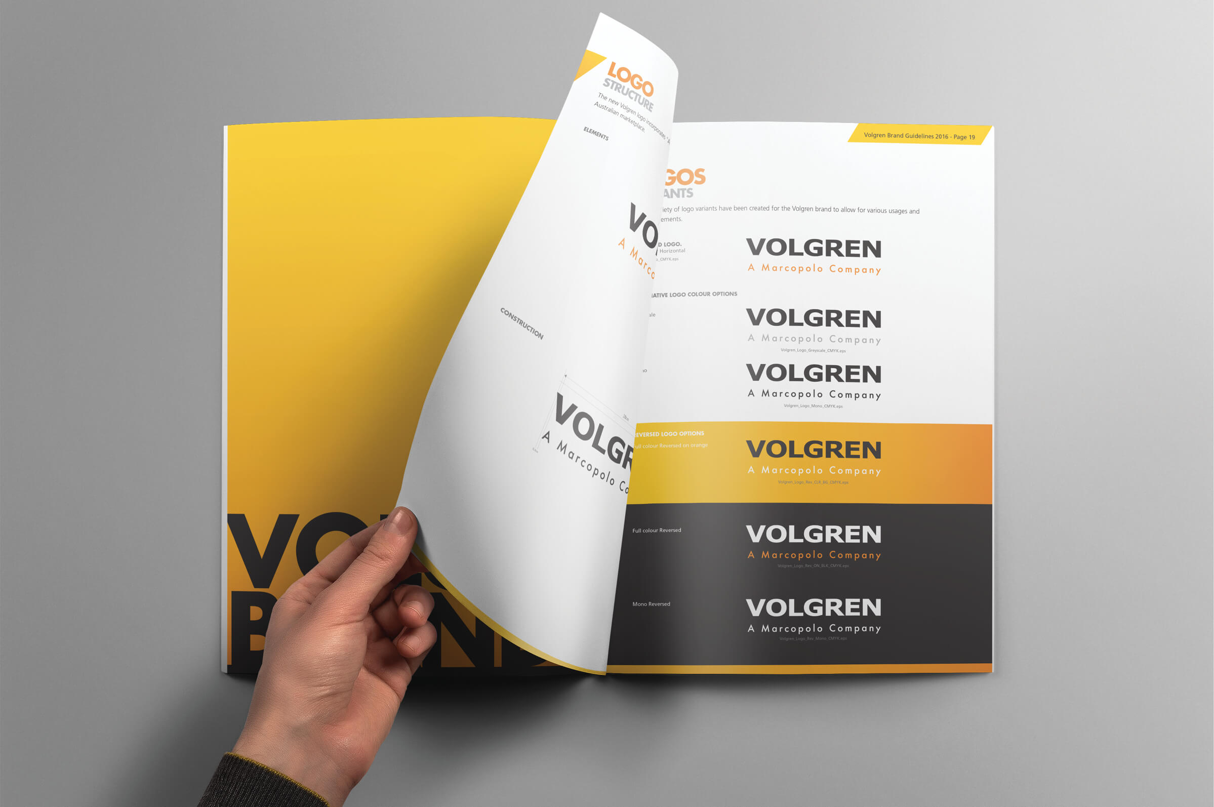
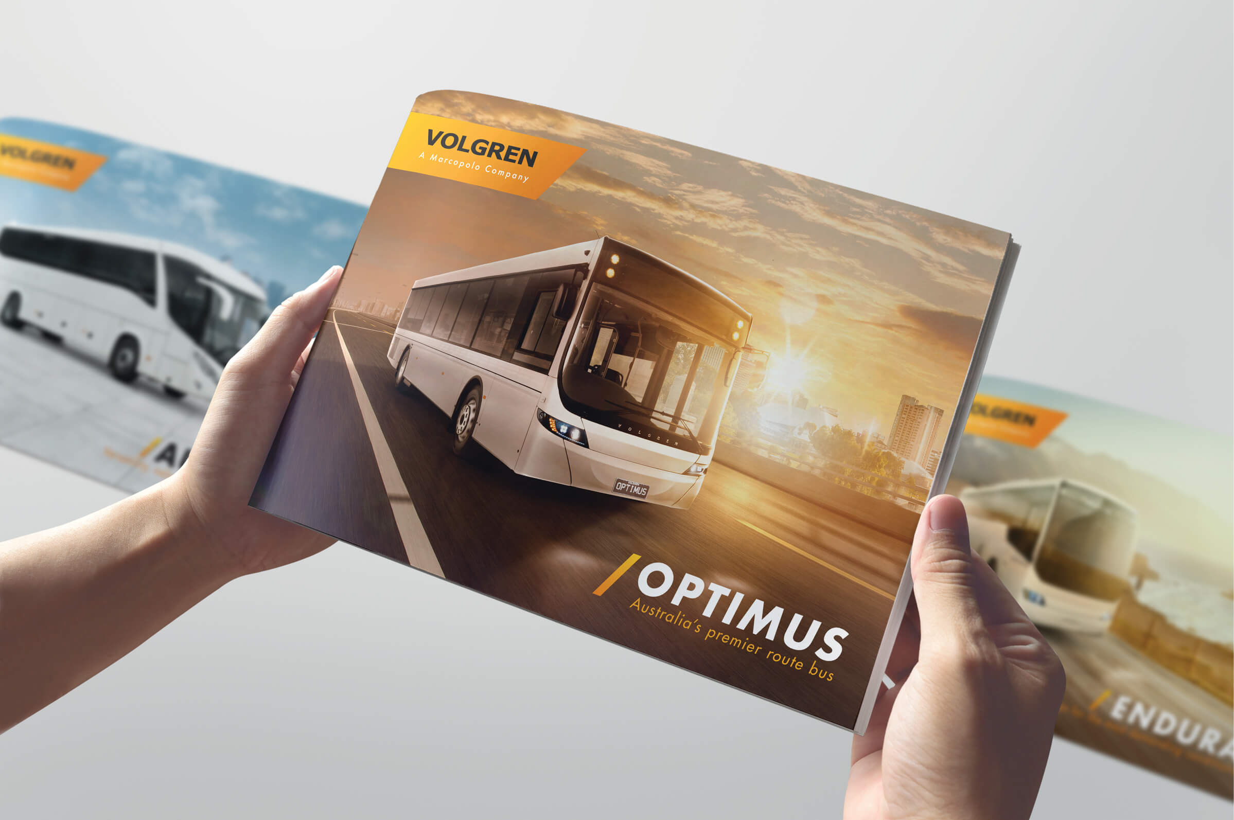
The new design incorporates some of the Marcopolo colours and fonts, whilst maintaining the original Volgren wordmark. The angular shapes are reflective of the vehicle styling and show forward movement and progression. Extensive photography of the factory staff from around Australia was undertaken to ensure that Volgren’s staff were the hero’s of the piece along with new high-end imagery of the buses.
Colour Andre was engaged to complete and project manage all visual aspects of this project including; Brand strategy workshops, New Brand Identity and Style Guide, Photography, Retouching, Collateral, Press & Digital design.
See the full case study below.
Client: Volgren
Campaign: Branding & Style guide
Working with: Effectus Marketing Group
Colour André: Art Direction, Design, Branding, Finished Art, Photography, Retouching, Digital design, Project Management
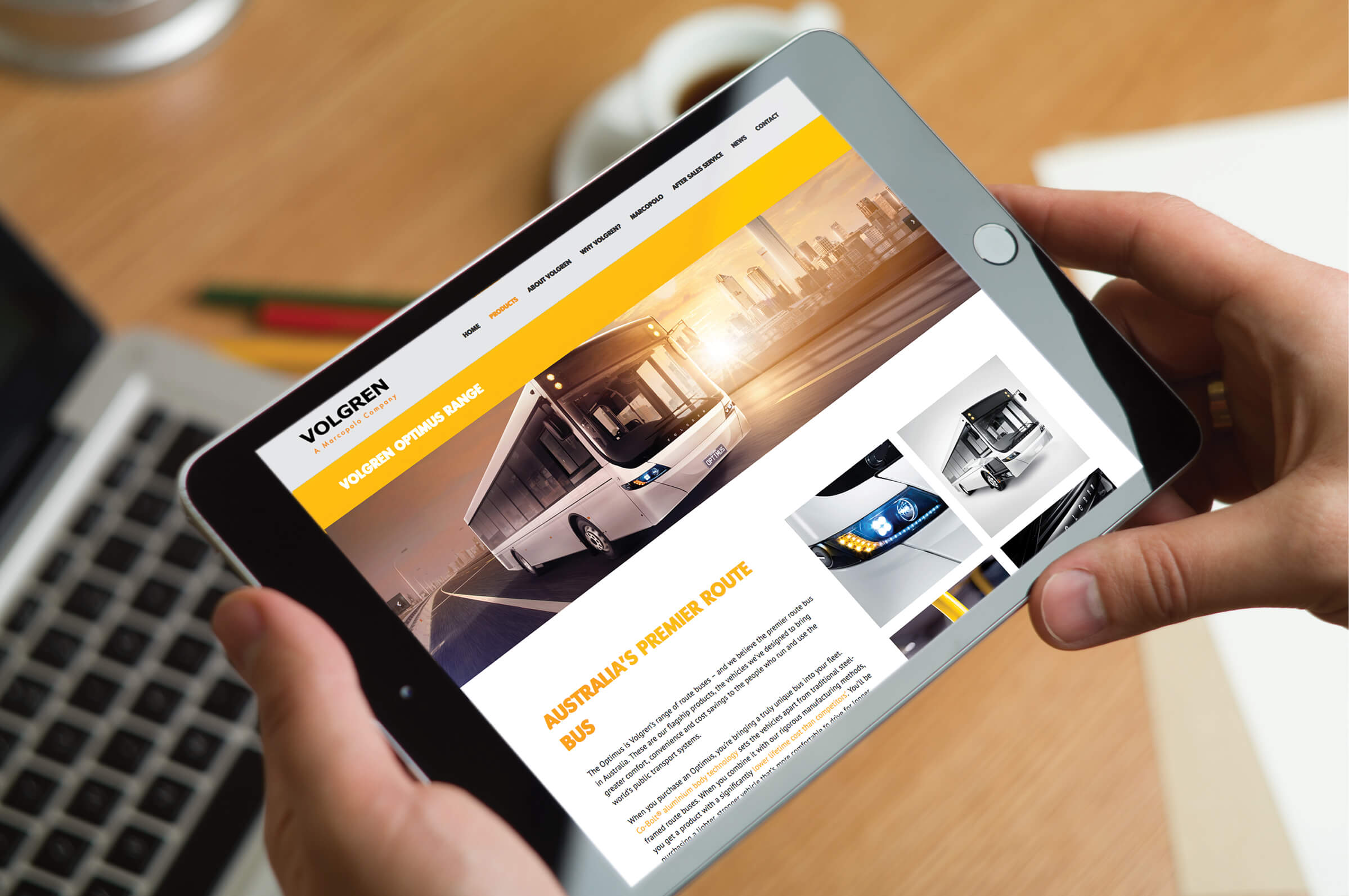
Project Partners: Betty Wants In (Photography), BVN Creative (Website Build), Effectus Marketing Group (PR)
Tagged with: Australia, Brand, branding, brochures, buses, competition, Guide, Logo, manufacturing, Marketing, photography, Rebrand, Retouching, Style, Volgren
Comments (0)
Be the first to leave a reply!